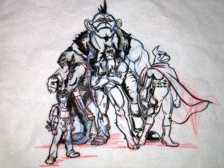
A draft of my animal design home work. Clearly, composition is still my wakeness, as well as inking. It is still quite consufing on some of the details. Like the 3 characters on the middle ground and the back ground seems to be to close. I will focus on releasing the compositionial tentions... and study more master work's inking techniques...however, bear with me, haha


Actually, Echo...I think it's more of an inking problem then composition here...it's not a terrible comp.
ReplyDeleteYou need to figure out the lights and darks in the composition to pull it together a bit better.
Using blacks to push things forward in front of other shapes is a big help. Also using shadows on characters will make them look more clear and separated from one another and not 'unclear' as you have here.
Make some copies of your pencil work and take some markers to them and try different ideas for lighting, etc...then you will have a map to go by when you get some of the problem areas worked out before you go to final inks!
You're doing well, tho' and I checked out your animation stuff...funny work!
Keep it up!
-John
haha, John, I thank you for the advises and suggestions!! I can't wait to get better at it~ hoho
ReplyDeleteYou make me sick with your quick sketches! You're so good with that stuff. I've had it with the drawing exercises we have to do in fine arts--so boring and it isn't helping me to get any better! It just turns me off to drawing alltogether so I don't practice outside of class and homework assignments. Maybe I should just draw the fun kinds of things you do to keep myself interested! (including dead people....)
ReplyDeleteWell, I love your stuff as usual. I'm glad you're working hard and getting better and better all the time. See you at school.
-Kelly